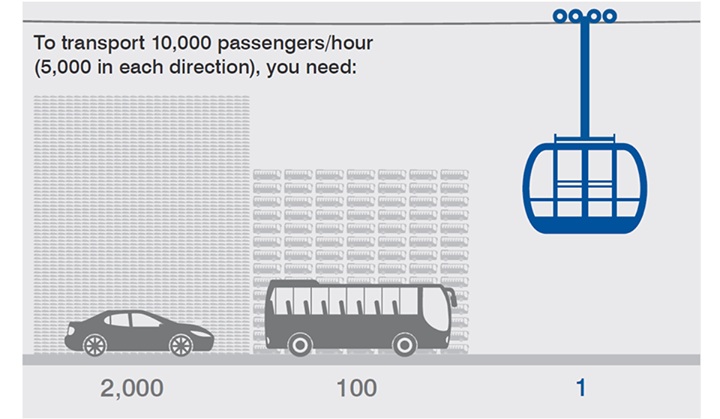
Like most people, we love infographics. But we really enjoy a good visual breakdown of transit capabilities, such as this collection of images from around the world. So when we came across the above graphic on Doppelmayr’s Facebook page, we thought it would be worth sharing.
3 Comments
10.000 passengers to transport with: 2000 cars, 100 busses, 1 cable car cabin…
wow, that is so wrong.
if it says 1 on the right side (the cable car cabin) it should also say 1 on the left side.
because: 1 road (with 1 line for each direction – same as the cable car)
to transport 10.000 passengers OF COURSE you’ll need more than 1 cabin. that graphic should get corrected.
(and of course the length is important – but not in this particular case)
Our understanding of the chart was that the cable car represented one CPT system. It’s a bit of an oversimplification, but meant to illustrate the effect on traffic/congestion.